

Tabs
Audience: All editor roles
Please note, this product is in development and you may find videos and documentation don't reflect current functionality.
Topic covers how to add and edit the tabs component on a page.
The tabs component lets users navigate between related sections of content, displaying one section (or tab) at a time.
Because tabs hide content, only use them when user research shows they help users navigate related content efficiently - never for essential information that all users must see. See when to use tabbed content and the accessibility guidelines.
How to add and edit tabs
Adding the component to a page
- After opening a page, click the blue plus icon where you want the tabs to appear.
- Select ‘Tabs’ from the pop-up window.
- In the tabs window:
- Set the width of the tabs.
- Add an optional anchor link.
- Click 'Apply' to add the tabbed content to the page.
Editing the tabs
- Each tab has a heading and a content area.
- To add a heading, hover over the tab and click the edit icon. Replace the placeholder text with a short but meaningful title.
- To add content, click the blue plus icon under the heading and select 'Text'.
- Add and edit your content in the new window.
- On the 'Styles' tab, set the tabs width, optional anchor link, and column span.
- Click 'Apply' to add the content to the tabs.
- Repeat this process for each tab.
- To add new tabs, click 'Add Tab'.
- After adding tabbed content to a page, you can amend the content in the edit pane which automatically opens on the right-hand side of the screen.
- Any changes you make are immediately updated in the preview page to the left.
- Refer to the accessibility guidelines below for more information.
Using the tabs section toolbar
Use the toolbar to:
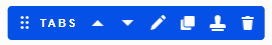
- Move the component up or down the page
- Edit the component settings
- Copy the component
- Save the component as a reusable template to use elsewhere on your site
- Delete the component from the page.
When to use tabs
Tabs can be a helpful way of letting users quickly switch between related information if:
- your content can be usefully separated into clearly labelled sections
- the first section is more relevant than the others for most users
- users will not need to view all the sections at once.
Tabs hide content from the user. Not all users will notice them or understand how they work. For this reason, you should only use tabs in specific situations and if user research supports it.
Do not use tabs for content that all users need to see.
Creating accessible tabs
- Tabs hide content, so the tab headings need to make it very clear what they link to, otherwise users will not know if they need to click on them.
- Order the tabs according to user needs. The first tab should be the most commonly-needed section. Arrange the other tabs in the order that makes most sense for your users.
- Avoid tabs that wrap over more than one line. This makes it harder for users to see the connection between the selected tab and its content.
Timed transcript
0:01
In this video, you'll learn how to add and edit tabbed content in Fresco.
0:07
Tabs are a great way to organise your content on long pages, and they make it easier for your users to scan and navigate a page. So let's get started.
0:17
After signing into Fresco, go to the 'Content' section. Find the page you want to edit and click the 'Edit' button to open a draft.
0:31
Locate the section you wish to edit and click the blue '+' icon where you want the tabs to appear.
0:39
In the pop-up window, select 'Tabs'. Please note, not all of these components will be available to you immediately.
0:50
In the 'Create New Tabs' window, you can set the width of the tabs using the drop-down menu and you can add an optional anchor link.
1:00
Click 'Apply' to insert the tabs on your page.
1:08
Each tab has a heading.
1:10
This is what users click on to open the tab, and a content area.
1:18
To edit, hover over the tab heading and click the pencil icon.
1:23
Replace the placeholder text with a short but meaningful heading.
1:30
Make sure to use clear language that will make sense to your users out of context.
1:36
Next, place your cursor in the box under the heading.
1:41
Click the blue '+' icon and select 'Text'.
1:50
In the pop-up window, add your content to the new window.
1:55
Use the WYSIWYG toolbar to format your text.
1:58
If you need more advice about how to do this, visit the Fresco Help site.
2:05
In the 'Styles' tab, you can adjust the width of the tabs,
2:10
Add an optional anchor link, and choose how many columns the tabs should span.
2:18
When you're done, click 'Apply' and the content will appear on the page.
2:25
Repeat this process for every new tab.
2:29
To add more tabs, click the 'Add Tab' button.
2:36
At any stage, you can reorder the tabs by dragging and dropping them into position.
2:46
To delete a tab, you simply select the bin icon. On the tabs toolbar,
2:57
you can copy the tabbed content, save the component as a reusable template to use elsewhere on your site, or delete the tabbed content by using the bin icon.
3:12
The toolbar functionality is covered elsewhere in our Fresco Help pages.
3:19
When you've finished editing, click 'Save' and then click 'Exit Editing'.
3:29
You can preview your changes on the page.
3:32
And that's it! You've successfully added and edited tabbed content in Fresco.
3:38
You can find more detailed information about tabbed content on the Fresco Help site.