
Selected content
Role: All editing roles
Use the Selected content component to manually build a list by selecting existing pages on your site. Choose this component if you want to sort items in a particular order or display a curated set of items rather than using a dynamic Listings component to display everything by filtering on a content type or taxonomy.
0:01
Selected content can be added to Columns, Tile Grid, Slideshow and Accordions.
0:09
I'm choosing Columns for this demonstration.
0:12
Start by adding a section and choosing Columns.
0:18
I'm going to use the default one column layout, and Apply.
0:24
Next you have to add the component.
0:28
Scroll down until you find Selected content.
0:34
The default display style is Portrait image.
0:37
Expand the drop-down menu to view Portrait text only, Landscape image, Landscape thumbnail and Landscape text only.
0:48
I'm going to use Landscape image.
0:52
Then you have to search for your existing bit of selected content.
1:00
Once you've found it, Apply.
1:05
You're then able to add additional components to start building your list.
1:11
Let's add a second one.
1:17
Remember to change the display style to what you used previously.
1:29
I now have two items in my list.
1:33
I'm just going to minimise the Edit Pane.
1:41
I'm going to add a third.
1:56
Now I have three items in my list.
2:00
You're able to re-order these in two different ways.
2:06
If you select an item, you can use the up and down arrows to move it into position.
2:14
So let's move it up one.
2:23
You're also able to use the waffle and drag it into position.
2:30
Additionally, this editing interface offers you a component outline.
2:35
You can use this to drag a component into a new position.
2:47
Once you're happy with the order, save your changes and exit editing to view your finished page.
How to add selected content
Choose a Section layout component
- Selected content can be added to Columns, Slideshow, Tile Grid and Accordion
- Add a Section and choose your preferred layout
- The default for Columns is one-column
- Apply
Add Selected content component
- Add a component to the column
- Scroll down and select Selected content from the component list
- Choose a display style (Fig. 1)
- Portrait image (default)
- Portrait text only
- Landscape image
- Landscape thumbnail
- Landscape text only
- Search for the existing content you want to use
- Buttons are turned off by default
Toggle on 'Show buttons', as required
Warning is displayed:
Add button text describing the link target. To be accessible this must be unique to each target page. This can be updated in the listing set up of the target page.
- A button with a chevron icon is automatically added to your listing item. You must complete the button listing set-up to meet accessibility compliance
- Use the Sa11y accessibility tool to check each listing item and Selected content list displays unique button text
- Buttons can also be toggled on after the component has been added to a page
- Apply
- Repeat the process to add additional selected content items to build your list
- Ensure each new item uses the same display style for consistency
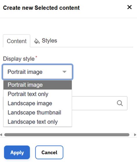
Fig. 1 Drop-down menu of display styles
Re-ordering content
- Move items using the up/down arrows on each item's component toolbar (Fig. 2)
- Drag items using the waffle icon on the component toolbar (Fig. 2)
- Use the component outline to reposition selected content items (Fig. 3)

Fig. 2 How to move a component
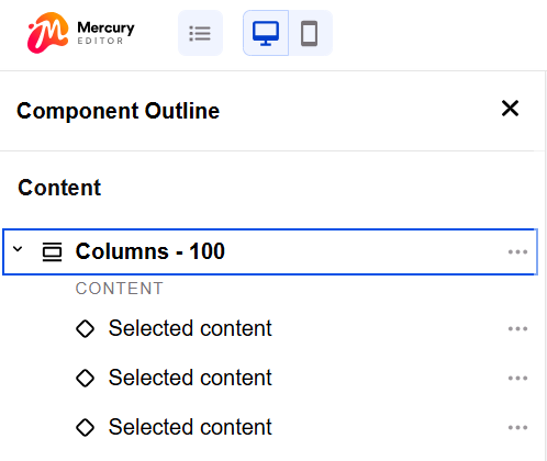
Fig. 3 Component outline
Usage advice
- Remember all content has to exist before you can add it
- Add listing set-up information
- Publish
- Ideal for items of the same content type
- For example, a curated list of articles or a project team
- If you want to mix items such as events, which have a date, with pages which don't display a date, and you prefer a portrait layout, insert selected content into a Tile Grid for optimal card alignment
- Be aware components can be deleted if you change a column layout. For example, reducing from three columns to two.
Changes may have been made to enhance this feature since we last updated this page. See What’s new for the latest release information.
Last updated: 21 April 2026