
Card
Role: All editing roles
Use a Card component to create a list of static content. Build each listing item by supplying an image, text and a URL to link the item to. Static content can be used to link listing items to pages on other websites.
0:01
Start by adding either Columns, Tile Grid or an Accordion.
0:09
I'm going to use a Columns layout and four columns.
0:19
Tile Grid is useful if content varies between cards and you want buttons to align.
0:27
Your next step is to add the Card component itself.
0:34
The default layout is Landscape image.
0:38
Expand the menu to see Landscape text only, Landscape thumbnail, Portrait icon, Portrait image, and Portrait text only.
0:50
I'm going to use Portrait image for my four-column layout.
0:56
There's also a Content tab.
0:58
This is where you can add a link to the Card, the main content in the Card.
1:05
The Styles tab gives you the opportunity to add an Anchor link, a jump link to that particular Card.
1:13
There's also a feature to allow the Card to take up more space than just one column, so it could occupy two columns, three or four.
1:23
The default is one, and Apply.
1:30
You can return to these tabs at any time by selecting the Card and using them in the Edit Pane.
1:40
Next, we're going to start populating the Card itself.
1:44
Let's start with the image.
1:47
When you select an image, it opens in the Edit Pane and you add media in the usual way.
1:55
This takes you to the media library, where I'm going to select an image I've already got on my site.
2:10
The optional Tags work like a taxonomy term, except they're not exposed.
2:18
Unlike in dynamic lists.
2:22
These Tags are limited to 50 characters.
2:27
If you add Cards to a Tile Grid, you can of course add taxonomy terms to the grid itself, e.g. graduate students.
2:37
For now, because this is static content, you could identify this particular card as a person, a name of a graduate student, their level.
2:49
E.g. for DPhil.
2:50
Because I'm creating one for an event, I'm going to add a Tag to say that it's online.
3:01
You can also duplicate this Tag and then edit that one, so my event might also be in-person.
3:13
You can't, however, change the background colour.
3:18
Next we're going to add a Card Title.
3:30
The default Heading level is 3 and you would amend this depending where your columns layout is going to appear on the page.
3:39
For now I'm going to change it to Heading 2.
3:44
Then we have the Card Strap line.
3:46
This is a teaser to generate interest.
4:00
And then you add Card Text for a fuller description.
4:14
Finally you have the option to add a Button.
4:35
And an appropriate link.
4:39
I'm going to add a link to an external site, but you can of course link to existing content on your site.
4:53
If on your Card you don't want to use any of these default fields, you simply select a field and on the toolbar you see there's the delete icon.
5:06
Now let's Save and Exit to view the draft page.
5:18
You repeat these steps until you have all of the Cards in the column layout that you need.
On this page
Related information
- Listings
- Tile Grid
- Copying Sections
- Pattern Book examples (promoting items and stacking Columns)
- Pattern Book examples (Card)
How to edit
Getting started
- Choose a container: start by adding a Columns layout, a Tile Grid, or an Accordion to your page
- Tip: use a Tile Grid if your content varies but you want any Buttons to be aligned
- Add the Card component into your chosen layout
- Select an appropriate layout style for the number of columns the layout uses: the default is Landscape image. Expand the menu to switch to another format:
- Landscape (Text only or Thumbnail)
- Portrait (Icon, Image, or Text only)
- Note: when adding a Card to a Tile Grid: under the Styles tab, you can set the Card to occupy more than one column (to span two, three, or four columns). The default is one column
- To promote a Card across multiple columns in a Columns layout, add it to a 66/33 layout, for example
Populating Card Content
- Add an Image: select the image area to display the 'Add media' button in the Edit Pane
- Add a Tag (optional): use the Tag field to add a brief identifier (max 50 characters)
- For example: for an event, you might add 'Online' or 'In-person'. These are static identifiers for the Card and do not function like dynamic taxonomy terms
- Tip: you can duplicate a Tag and edit the text to display multiple Tags
- Add a Card Title: set the Heading level (default is H3) based on the hierarchy of your page
- Add a Strap line (optional) as a short teaser to generate interest
- Add Card text (optional) for a fuller description
- Add a Button (optional) and provide a link to either an internal page or an external website
- If you have more than one button on a page:
- To be accessible, button text must be unique to each target page
- Overwrite any default text such as 'Read more' to describe the link target in a meaningful way
- If you have more than one button on a page:
Editing content
- Remove unused fields: if you do not require a specific field (like the strap line or button), select the field and click the Delete (trash can) icon on the toolbar
- Anchor Links: in the Styles tab, you can add an anchor link to allow users to jump directly to a specific Card from elsewhere on the page
- Review Card links to content:
- you can add three different links: to the Image, the Card body and to a Button
- do you need them all?
- you can add three different links: to the Image, the Card body and to a Button
- You can return to the Edit Pane at any time by selecting a Card to modify the Content, Layout or Styles tabs
- Save and Exit editing to view your draft
Usage advice
- Select the appropriate Card layout for optimal display within a multi-column Section
- For example, choose Portrait Image for a 25/25/25/25 four-column layout
- Cards can be used to create a People listing when the individuals don't have a Person page on your site
- For example, an external partner (research, industry); a Guest Lecturer; a donor
- Cards can be used to create an Event listing when you want to signpost external events
- Edit a Card for a specific use and copy it to populate a four-column Section. Save the Section as a Template to achieve a consistent look on your site (Fig. 1)
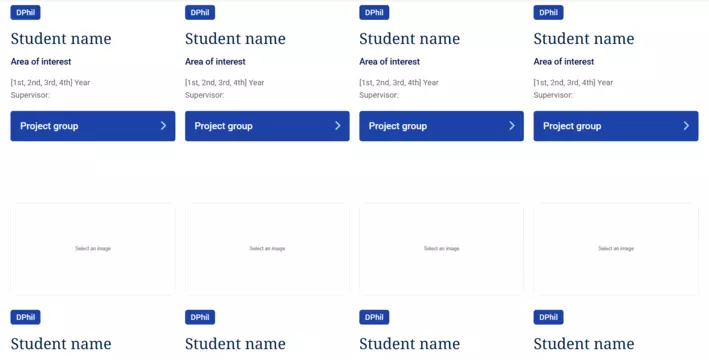
Fig. 1 Section template added twice to a page
Changes may have been made to enhance this feature since we last updated this page. See What’s new for the latest release information.
Last updated: 7 April 2026