
Site colour themes
Role: Site Administrator
This page explains how to customise your site's colour theme using the Appearance settings. The design options available depend on your site's assigned category. Further, Fresco includes built-in accessibility checks to help you choose colour combinations that provide sufficient contrast and meet WCAG accessibility standards.
How to edit
Site Design Categories
There are three site categories that define the scope in which you can edit the colours/theme of your site.
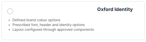
- Oxford Identity
- Limited colour options
- Prescribed font and header
- Layout configured via approved components
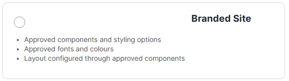
- Branded Site
- Approved components and styling options
- Approved fonts and colours
- Layout configuration via approved componnets
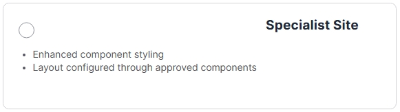
- Specialist Site
- Enhanced component styling
- Layout configuration via approved components
For further information on Site Categories, please review: Site categories and design options
Getting Started
Choosing a Colour
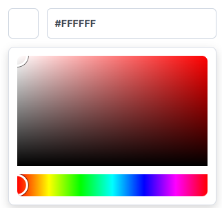
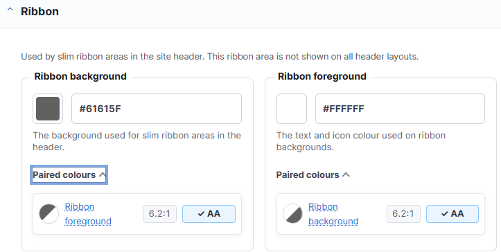
You can select a colour using the colour picker or by entering a Hex colour code (for example, #FFFFFF).
When you select a colour, the Paired colours section displays colours that are used alongside the selected colour elsewhere in the same theme section. Each pair is automatically checked against WCAG (Web Content Accessibility Guidelines) colour contrast requirements to help ensure your site remains accessible.
Each colour pair is given an accessibility rating:
- AA – Meets the minimum recommended contrast requirements.
- AAA – Meets the enhanced contrast requirements.
These ratings are based on the following contrast ratios:
- AA Pass = 4.5:1 (Normal Text) and 3:1 (Large Text)
- AAA Pass = 7:1 (Normal Text) and 4.5:1 (Large Text)
Contrast checks are performed for both Text and Accent colour combinations.
Colours
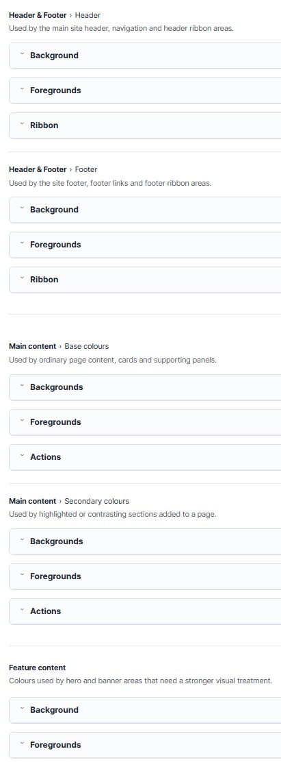
Your site's theme consists of Colours and Fonts. The Colours section controls the colours used throughout your site and is divided into the following areas:
- Header & Footer
- Header
- Footer
- Main Content
- Base colours
- Used by ordinary page content, cards and supporting panels
- Secondary Colours
- Used by highlighted or contrasting sections added to the page
- When editing a column select 'Styles' and then select 'Secondary' under 'Theme Colour Context' to apply Secondary Colours
- Base colours
- Feature Content
- Hero and banner areas that need require distinct visual identity
Within each of these sections, a number of colour options exist:
- Background
- Used behind the main regions of the element
- Foregrounds
- Used for text, links, icons and small accents
- Ribbon
- Used by slim ribbon areas within the element
- Action
- Used for buttons placed inside highlighted or contrasting sections
Previews & Publishing
If you are making significant changes to your site's colour theme, it is recommended that you use the Preview feature before publishing your changes. This allows you to review your new colour scheme across your site without affecting the live version.
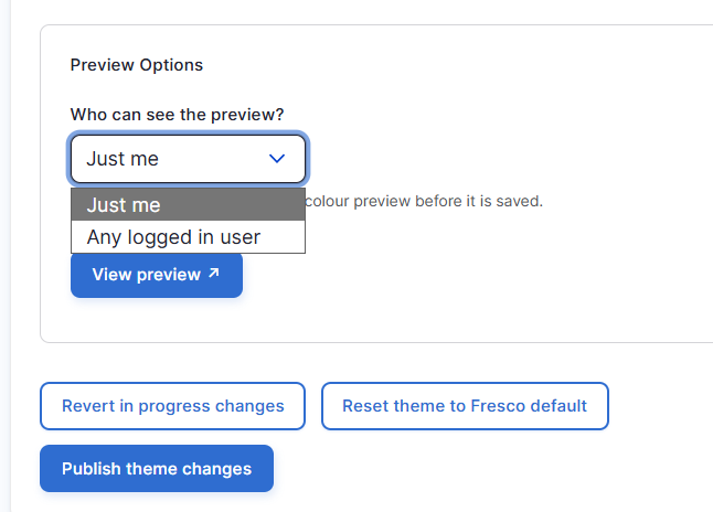
After making a change to a colour, select who should be able to view the preview:
- Just me: Only you can view the preview.
- Any logged in user: All logged in users can view the preview.
Select View preview to enable the preview, then browse your site to see how your changes appear in different pages and components before publishing.
If you decide not to keep the preview:
- Disable preview: Stops the preview and returns users to the published version of the site.
- Revert in progress changes: Discards all unpublished changes and restores the theme to its currently published state.
- Reset theme to Fresco default: Resets all theme settings to the default Fresco colour scheme, allowing you to start again from a clean baseline.
Once you are satisfied with your preview, select Publish theme changes to apply your new colour theme across the site. These changes will become visible to all users and replace the previously published theme.
Changes may have been made to enhance this feature since we last updated this page. See What’s new for the latest release information.
Last updated: 29 June 2026