
Local Navigation
Role: All editing roles
Local Navigation helps visitors move between pages within the same section of your website. Unlike the main navigation, which links to the major sections of your site, Local Navigation displays links that are relevant to the section the visitor is currently viewing.
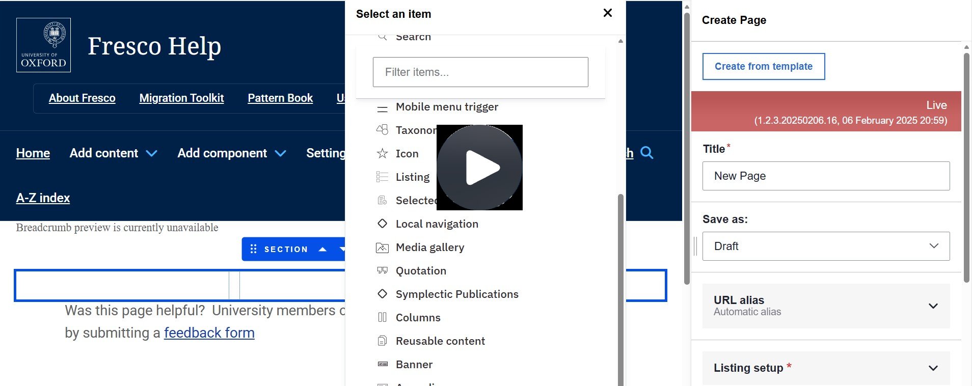
Fig. 1 Still from the video ‘How to use the Local Navigation Menu component’. Video length 4:49
Click Fig. 1 image to view the video on SharePoint Online. Available to users who are logged in to our organisation’s intranet
0:00
Navigate to Settings > Menus and Add menu. Give it a meaningful title and optional description so you can easily identify it when adding to a page. E.g. Local Nav Test Menu configuration.
0:16
You can add links immediately or return later.
0:19
To edit and add links. E.g. click Edit menu for Local Nav Test, configure the parent link.
0:29
This can be the landing page for your section / collection of pages.
0:33
E.g. click Edit for full width display components.
0:38
Ensure active link is toggled on.
0:43
Search for the matching content in the link field.
0:48
Check Local Nav Test is selected as the parent link.
0:52
Ignore display settings.
0:57
Note the maximum depth for a link and all its children is fixed.
1:02
Menus added as components to the body of a page only support three levels of hierarchy, so some menu links may not be available if they would exceed this limit.
1:12
Click Save.
1:17
Reorder child items as required by using the drag handle next to each menu link.
1:22
Save to update the menu content Navigation.
1:29
Child items are automatically shown under the parent link. E.g. Hero component, Banner and Slideshow are under full width.
1:37
Display components.
1:39
Expand Hero component to show its child items.
1:45
Add the local navigation menu component to each page in your section / collection.
1:51
Let's add it to Hero article.
1:54
The component can only be added to columns.
1:57
You may need to change the existing columns layout.
2:01
Choose the same layout for each page.
2:04
E.g. select two columns, 25/75 existing content will be in the first column.
2:13
Move it to the second column using the drag handle on the component toolbar.
2:18
Click Add Component in this column.
2:21
In the first column, select Local Navigation from the list of components.
2:29
Select the correct menu from the list of all menus. E.g. Local Nav Test.
2:36
Optionally enable Show Title to allow you to enter an alternative title to display above the local navigation menu.
2:46
Optionally, type a new menu title in the Override menu title field.
2:51
In this example, to further personalize the user experience, we could choose to name the local navigation menu to say Hero component on all the child items.
3:00
When adding the component to each of those pages, optionally enable Sticky.
3:07
This means the local navigation menu will stick to the top of the screen when scrolling up and down the page.
3:14
Click Apply.
3:18
Click Save Changes.
3:22
Click Exit Editing to verify how the local navigation menu appears on the page.
3:27
The page you are on is shaded in the menu structure. E.g. Hero Article.
3:35
You can navigate to another page in the collection.
3:38
The menu link is shaded and underlined on hover. E.g. Hover over Full width Display components when you are on the Hero homepage.
3:48
Local navigation menu titles can be edited on the page.
3:52
Select the component and amend the Override menu title field or decide to toggle off Show Title.
4:01
We're going to override the menu title so that the Hero pages appear under their own titled menu.
4:07
Enter Hero component in the Override Menu title field and click Save Changes.
4:15
See how it looks when navigating the menu.
4:18
Starting on the page for Full width display components, click Hero Home.
4:25
The local navigation menu in use on Hero Home and Hero Article has been retitled to Hero Component.
4:33
The menu added to all the pages of child items under Hero Component would be titled for consistency.
4:39
In this way the menu on Hero Article is entitled Hero Component also.
Related information
- Main Navigation Menu
- Pattern Book (Local Navigation menu)
- Example on Fresco Showcase site
- Examples on other Fresco sites:
How to edit
Getting started
- Navigate to Settings > Menus > Add Menu
- Give it a meaningful title and optional description so you can easily identify it when adding to a page. e.g: Local Nav Test Menu Configuration
- Ensure active link is toggled on
- Either add further sub levels and links immediately or return later
- Menus added as components to the body of a page only support three levels of hierarchy, so some menu links may not be available if they would exceed this limit.
- Ignore the above steps if you already have a Menu set up that you wish to use
Page configuration
- Add the Local Navigation component to a page
- The Local Navigation component can only be added to columns
- Select your configured Menu (Fig. 2)
- Optionally enable Show Title to allow an alternative title to display above the local navigation menu
- Optionally type a new menu title in the Override menu title field.
- Optionally enable Sticky. This makes the local navigation menu stick to the top of the screen when scrolling up and down the page.
- Click Apply and Save Changes
Changes may have been made to enhance this feature since we last updated this page. See What’s new for the latest release information.
Last updated: 3 September 2026
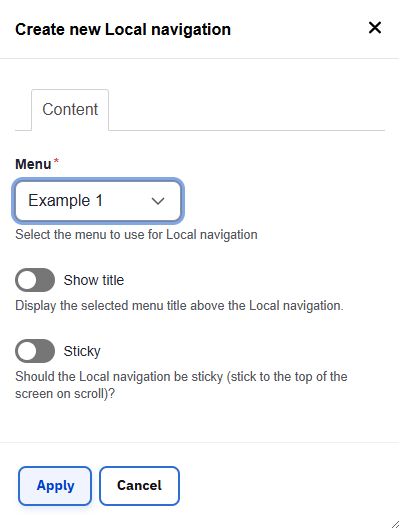
Fig. 2 - Local Navigation Window